Timeline
A composable timeline — a real ordered list with a marker rail, six semantic statuses, and event content you compose yourself from cards, chips, avatars, and semantic HTML.
Usage
Pull request #4812
Timeline component and docs page
- Pull request opened#4812
Priya Raman opened the pull request against release/1.4.
- Review requested2 reviewers
Priya Raman requested review from platform-core.
- Changes requestedblocking
Tomas Brandt flagged the connector bleed in timeline.css.
- Checks green812 tests
CI passed on the third run after a flaky retry.
- Approved2 of 2
Aiyana Cole signed off alongside Dan Whitfield.
- Merged to mainsquash
Dan Whitfield merged and deleted the branch.
Timeline is for read-only chronology: activity feeds, audit trails, incident history, release logs,
roadmaps. Anything where the order is the meaning and the reader is looking back at what happened.
It deliberately has no notion of a current step you can advance, no completion state, and nothing to click. Events are content, not controls. If the user needs to move through a known sequence — a checkout, an onboarding flow, a multi-step form — a timeline is the wrong shape; that job wants a stepper, which this library does not yet ship.
The API is composable rather than a single component with props, which is the same exception the Legend takes. An event carries a card, a chip, an avatar or prose, and props cannot express that. Children can.
Anatomy
Import the Timeline component and access all parts using dot notation.
import {Timeline} from "@blakeui/pro-react";

<Timeline>
  <Timeline.Item>
    <Timeline.Rail>
      <Timeline.Marker />
      <Timeline.Connector />
    </Timeline.Rail>
    <Timeline.Content />
  </Timeline.Item>
</Timeline>;Timeline.Rail, Timeline.Marker and Timeline.Connector are all supplied automatically when you
leave them out, so an item needs only its Timeline.Content — write them explicitly when you want to
give the marker children or force a connector.
The component owns the chronology layout and nothing else. It renders an <ol> of <li> and gives
each item a rail; everything inside Timeline.Content is yours, and keeps its own semantics —
headings stay headings, <time> stays <time>, links stay focusable. Use real HTML and real
components in there rather than reaching for props that do not exist.
Centered Milestones
axis="center" runs the rail down the middle, which is the only axis on which placement means
anything — an edge rail has one usable side, so every item resolves to side="end" there.
placement="alternate" then flips content from side to side, and itemAlign="center" puts each
marker at the middle of its own block so the alternation reads as one spine.
- Shipped
Kickoff
Scope agreed with the platform team and the two design partners who asked for it first.
14 requirements · 3 teams
- Shipped
Layout spike
Two-week spike on the rail geometry. The three-row grid came out of this.
6 prototypes · 1 kept
- Shipped
Internal alpha
Internal alpha behind a flag, seeded with the activity feed from the release dashboard.
38 internal users
- Shipped
Accessibility audit
Accessibility pass. The tree was rebuilt around a real ordered list after the first audit.
9 findings · 9 closed
- Current
Public beta
Opened to 40 design-partner accounts with the composable API frozen.
40 accounts · 1.2k items rendered
- Planned
General availability
Billing, the migration guide, and the codemod off the old activity list.
3 blockers open
- Planned
Virtualised feeds
Virtualised rendering for feeds past a thousand events, sharing the data-grid virtualiser.
Target: 10k items
Studio Review
- MCheckout — payment stepNeeds workMarguerite Okonjo · Today, 09:20
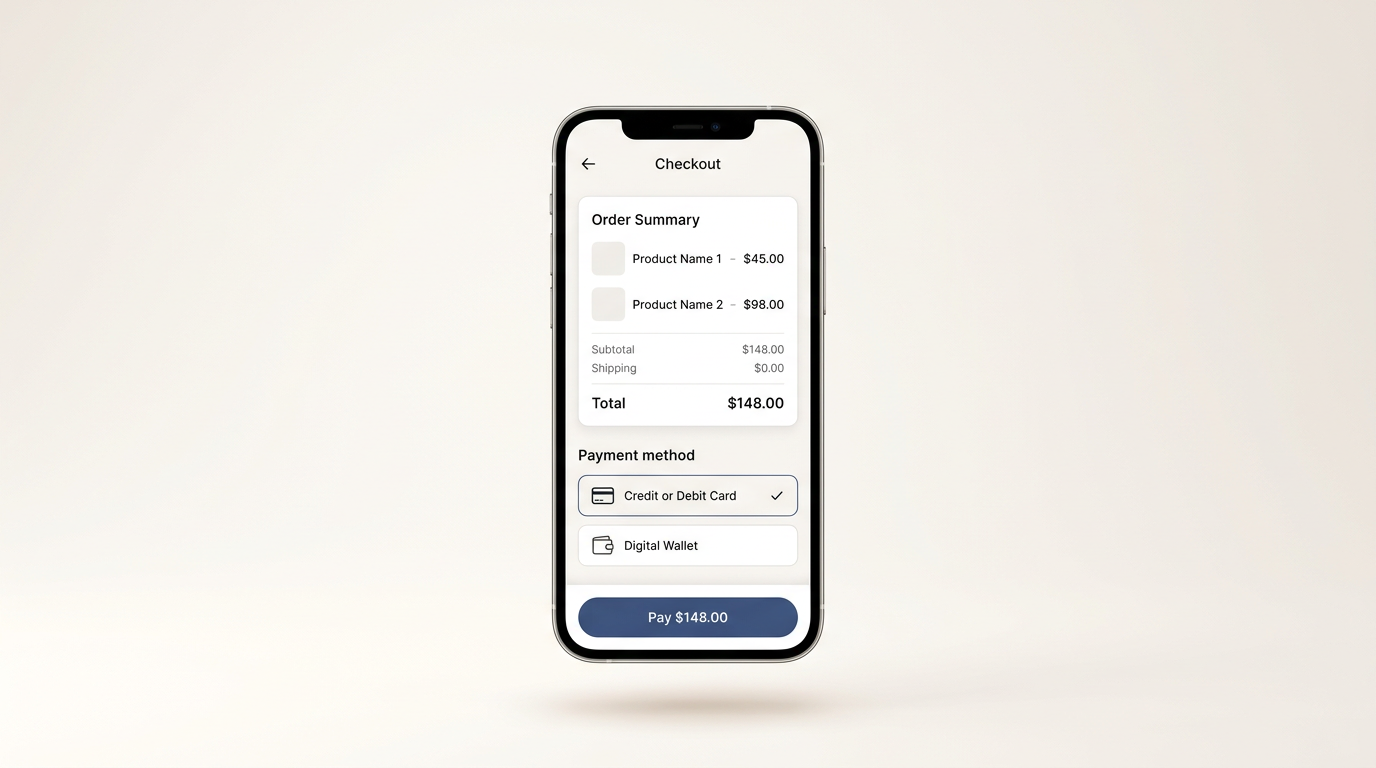
The card total sits below the fold at 375px, so the pay button is the first thing a thumb reaches. Moving the summary above the method picker fixes it without a new screen.
MobileCheckout2 blockersOpen the annotated frame - TDashboard — first-run empty stateTomas Brandt · Today, 08:05
- AReports — export drawerApprovedAiyana Cole · Yesterday, 17:42
- KSettings — billing plan pickerKofi Mensah · Yesterday, 15:10
- IOnboarding — workspace inviteApprovedInes Delacroix · Yesterday, 11:33
- RSearch — result groupingRina Takahashi · Mon, 16:58
Compact Log
- Promoted to production
Build 4812 promoted after the canary held for an hour.
- Rotated the staging signing key
- Stale token revoked
d.whitfield revoked a token last used 94 days ago.
- Reconciled 1,284 invoices
- Access granted
m.okonjo granted read access to analytics-ro.
- Nightly snapshot uploaded
- Pool sizing changed
Connection pool ceiling raised from 40 to 120.
- Maintenance window closed
- Workers restarted
Two workers restarted after an OOM in the export queue.
- Retention sweep completed
Incident Response
Incident INC-2291
Checkout error rate above 5%
- MMarguerite Okonjoposted the write-up
The pool ceiling had been at 40 since the eu-west-1 cutover in May. Under the promo burst it saturated in ninety seconds and checkout queued behind it. Raising the ceiling cleared it; the sizing now moves into the deploy check so it cannot drift again.
inc-2291-postmortem.pdf · 248 KBpool-saturation.png · 1.1 MBOpen the latency dashboard - PPriya Ramanopened the incident
- DDan Whitfieldpaged the database on-call
- KKofi Mensahshifted traffic away from eu-west-1
- AAiyana Coleraised the connection pool ceiling
- RRina Takahashiconfirmed the error rate under 0.1%
- IInes Delacroixclosed the incident
Version History
Version history
- v1.4.0Latest
Timeline ships. Legend gains a value suffix and the odometer keeps its slot on shorter values.
PPriya Raman · 24 Jul 2026 - v1.3.0
Overlay easing moved off the plain-ease alias across eight components.
DDan Whitfield · 11 Jul 2026 - v1.2.0
Table header and row-pill radius normalised to 16px so primary and secondary match.
AAiyana Cole · 29 Jun 2026 - v1.1.0Breaking
Charts moved to visx. Recharts removed from all twelve engines.
KKofi Mensah · 2 Jun 2026 - v1.0.4
Data grid gains virtualised rows and a run-aware multi-select.
IInes Delacroix · 18 May 2026 - v1.0.2
Item card and item card group settled as bordered-flat surfaces.
RRina Takahashi · 3 May 2026 - v1.0.0Initial
First public release: twelve charts, six data-display components, one theme.
TTomas Brandt · 15 Apr 2026
Repository Activity
- Pushed to two repositories
- lumenforge/interface
- 126 commits
- lumenforge/tokens
- 18 commits
- Opened a pull request
Pin the rail and the content to grid row 1
Auto-placement cannot walk backwards, so a start-side item dropped its content into a second row and left the rail at its own height.
+128−346 - Triaged the backlog
- lumenforge/interface
- 3 issues
timelinea11yneeds-design - Pushed to two repositories
- lumenforge/docs
- 41 commits
- lumenforge/examples
- 9 commits
- Reviewed the rail geometry
- lumenforge/interface#812
- 14 comments
- Cut a release
- lumenforge/interface
- tagged v1.4.0
release1.4.0 - Pushed to three repositories
- lumenforge/interface
- 58 commits
- lumenforge/tokens
- 6 commits
- lumenforge/docs
- 23 commits
Split Content
On-call rotation
Tuesday, 27 July
- Handover
Priya Raman
Shift start
Two pages carried over from the Dublin desk, both on the export queue.
- Open pages
- 2
- Ack time
- 4m 12s
- Alert
Dan Whitfield
Latency alert cleared
Latency on the search cluster crossed the warning threshold and cleared without a page.
- Peak p99
- 1.8s
- Duration
- 9m
- Deploy
Aiyana Cole
Release promoted
Release 4812 promoted after the canary held a full hour at 10% of traffic.
- Canary
- 60m
- Error rate
- 0.02%
- Maintenance
Kofi Mensah
Replica rebuilt
Replica rebuilt from the 04:00 snapshot; replication lag back inside a second.
- Lag before
- 42s
- Lag after
- 0.6s
- Alert
Rina Takahashi
Workers restarted
Export workers restarted twice after an OOM traced to a single 900MB report.
- Restarts
- 2
- Queue depth
- 318
- Handover
Ines Delacroix
Shift end
Handed to Singapore with one follow-up filed against the export sizing.
- Open pages
- 1
- Follow-ups
- 1
CSS Classes
Base Classes
.timeline— The root<ol>.display: flexin a column withrow-gap: var(--timeline-gap),min-width: 0, and list styling stripped. The vertical rhythm is this gap rather than padding on the item, which is what lets a centred marker sit at the true middle of its own content; the two lines bridge the gap by bleeding into it with a negative margin..timeline--axis-start— Two columns,auto minmax(0, 1fr): rail then content. The default..timeline--axis-center— Three columns,minmax(0, 1fr) auto minmax(0, 1fr): content, rail, content. Both outer columns areminmax(0, …), so long content wraps instead of pushing the rail off centre..timeline--size-sm/.timeline--size-md/.timeline--size-lg— Set the four size variables together: a 12 / 16 / 20px marker, a 1 / 2 / 2px line, a 10 / 12 / 16px rail gap, and 13 / 14 / 15px content..timeline--density-compact/.timeline--density-comfortable— Set--timeline-gapto 12px or 24px. Nothing else moves.
Element Classes
.timeline__item— The<li>,display: gridwithcolumn-gap: var(--timeline-rail-gap). Carriesdata-status,data-sideanddata-align, plusaria-current="true"when the status iscurrent..timeline__rail— The marker-and-connector column, itself a three-row grid — lead line, marker, connector —justify-items: centerandalign-self: stretch. Atdata-align="start"the rows are0 auto 1fr, so the marker tops out and no line is drawn above it; atdata-align="center"they are1fr auto 1frand a::beforelead line fills row 1 on every item but the first..timeline__marker— The dot.var(--timeline-marker-size)square, fully rounded, withborder: 1px solid var(--timeline-marker-ring),background-color: var(--timeline-marker-fill)andcolor: var(--timeline-marker-ink). Bordered-flat — a ring and a fill, never a shadow. A marker with children (:not(:empty)) grows to--timeline-marker-size + 8pxon both axes and takes 2px of padding, and a descendantsvgis forced to 12px square..timeline__connector— The line to the next event.var(--timeline-line-width)wide,background-color: var(--separator), filling row 3 of the rail and bleeding a full--timeline-gappast the item so it meets the next marker. On the last item — where it exists only becauseforceasked for it — it becomes a 24px stub with no bleed, and:has()grows the item to hold it so the ink never leaves the<ol>'s box..timeline__content— The event.min-width: 0,font-size: var(--timeline-font-size),line-height: 1.5,color: var(--foreground). Under a centred axis itsdata-sidepicks column 1 or 3 and hugs it to the rail withjustify-self, which aligns the block without re-aligning your text.
Status Classes
Status is a data-status attribute rather than a class, set on both the item and the marker. The
marker's own value wins by proximity, so <Timeline.Marker status="danger" /> inside a default
item needs no extra specificity. Each value sets the same three custom properties:
[data-status="default"]—--defaultfill,--mutedring,--default-foregroundink. A solid neutral dot.[data-status="current"]—--accent-softfill,--accent-soft-foregroundring and ink, and a 2px ring instead of 1px so the live event is findable at a glance. This is the status that carriesaria-current.[data-status="success"]—--success-softfill,--success-soft-foregroundring and ink.[data-status="warning"]—--warning-softfill,--warning-soft-foregroundring and ink.[data-status="danger"]—--danger-softfill,--danger-soft-foregroundring and ink. The raw--dangeris never painted as a fill or as text: it is identical in both themes and measures 1.89:1 on the dark surface.[data-status="muted"]—--default-softfill,--mutedring,--default-foregroundink. Reads as hollow besidedefault's filled dot, so de-emphasis comes from the fill rather than from dimming the glyph.
Every ring clears the 3:1 non-text contrast floor in both themes. Marker ink clears 4.5:1 throughout
in light; in dark, current and danger sit at ~3.4:1 against their own tint, so prefer an icon or
a short glyph over a text label in those two, or leave the marker empty.
CSS Variables
All six are declared on .timeline and inherited by every part, so overriding one on the root
retunes the whole component.
--timeline-marker-size— Marker diameter.16pxatmd.--timeline-line-width— Connector and lead-line thickness.2pxatmd.--timeline-rail-gap— Horizontal space between the rail and the content.12pxatmd.--timeline-font-size— Content type size.0.875rematmd.--timeline-gap— Vertical space between items.24pxatcomfortable.--timeline-marker-nudge— Derived, not authored: how far a start-aligned marker drops to sit on the first line's optical centre,(--timeline-font-size × 1.5 − --timeline-marker-size) ÷ 2. The connector adds it to its own bleed so the stroke still reaches the next marker.
Motion
Items animate in on mount — opacity plus an 8px rise over 280ms on var(--ease-out), staggered 50ms
per item. The animation is motion/react rather than a CSS transition, so the reduced-motion opt-out
lives in JS and covers both halves: prefers-reduced-motion: reduce and an explicit
[data-reduce-motion="true"] on the component or any ancestor. Under either, the stagger is dropped
and the rise is snapped out in a single frame while the fade plays at full length — gentler, never
frozen.
API Reference
Timeline
The root. Renders an <ol>, holds the layout contract, and hands each item its index. Also accepts
every native <ol> attribute.
| Prop | Type | Default | Description |
|---|---|---|---|
children | ReactNode | — | Timeline.Item children. Required. |
axis | "start" | "center" | "start" | Where the rail runs — along the inline-start edge, or down the middle. Only a centred rail has two usable sides. |
placement | "start" | "end" | "alternate" | "end" | Which side of the rail content sits on. alternate flips it per item. Only meaningful with axis="center" — under an edge rail every item resolves to "end". |
size | "sm" | "md" | "lg" | "md" | Marker diameter, line weight, rail gap, and content type scale, moved together. |
density | "compact" | "comfortable" | "comfortable" | Vertical rhythm between items — --timeline-gap alone. Nothing else moves. |
itemAlign | "start" | "center" | "start" | Default vertical alignment of content against its marker. center also draws a lead line above each marker, so a centred rail stays unbroken. |
Timeline.Item
One event — an <li>. Also accepts every native <li> attribute.
| Prop | Type | Default | Description |
|---|---|---|---|
children | ReactNode | — | Item content — a Timeline.Rail and one or more Timeline.Content. A rail is supplied when omitted. Required. |
status | "default" | "current" | "success" | "warning" | "danger" | "muted" | "default" | Semantic tone, painted by the marker. "current" also marks the item aria-current="true" — the others are visual only. |
align | "start" | "center" | itemAlign | Overrides the root's alignment for this item. |
side | "start" | "end" | — | Overrides the side resolved from placement for this item. Ignored under axis="start". |
Timeline.Rail
The marker-and-connector column. Rendered automatically when an item omits it. Also accepts every
native <div> attribute.
| Prop | Type | Default | Description |
|---|---|---|---|
children | ReactNode | — | Rail content. A Timeline.Marker and a Timeline.Connector are each supplied when absent, so passing only one keeps the other's default. |
className | string | — | Class name for the rail. |
Timeline.Marker
The dot on the rail. Also accepts every native <span> attribute.
| Prop | Type | Default | Description |
|---|---|---|---|
children | ReactNode | — | Marker content — a number, a glyph, an avatar. An empty marker is decoration and is aria-hidden; one with children is content and stays in the accessibility tree. |
status | "default" | "current" | "success" | "warning" | "danger" | "muted" | the item's status | Overrides the item's status for this marker alone. |
className | string | — | Class name for the marker. |
Timeline.Connector
The line to the next event. Always decorative, so always aria-hidden. Also accepts every native
<span> attribute.
| Prop | Type | Default | Description |
|---|---|---|---|
force | boolean | false | Draw the connector on the last item too, as a trailing stub — "this continues past here". Without it the last item renders no connector at all, because there is no next event to point at. |
className | string | — | Class name for the connector. |
Timeline.Content
The event itself — a plain <div>, so whatever you put inside keeps its own semantics. Also accepts
every native <div> attribute.
| Prop | Type | Default | Description |
|---|---|---|---|
children | ReactNode | — | The event's content. Required. |
side | "start" | "end" | the item's resolved side | Overrides the side for this block alone. Give one item two Timeline.Content children with opposite sides to split an event either side of a centred rail. |
className | string | — | Class name for the content. |
useTimelineItem
Reads the current item's resolved state. Only valid inside a Timeline.Item — use it to build a
custom part alongside the built-in ones.
import {useTimelineItem} from "@blakeui/pro-react";

function StepNumber() {
  const {index, isLast} = useTimelineItem();
  return <span>{isLast ? "Final" : `Step ${index + 1}`}</span>;
}| Property | Type | Default | Description |
|---|---|---|---|
align | "start" | "center" | — | Resolved alignment — the item's align, else the root's itemAlign. |
index | number | — | Zero-based position among the root's children. |
isLast | boolean | — | True for the final item — this is what auto-hides its connector. |
side | "start" | "end" | — | Resolved side — the item's side, else placement read against index and the axis. |
status | "default" | "current" | "success" | "warning" | "danger" | "muted" | — | The item's semantic tone. |